- fractal software makes it hard to orient yourself, since everything looks the same regardless of the "depth" level - which is a feature of fractals
-
Gordon Brander suggests looking into how orientation works in cities - through landmarks - how could this look like in software?
- for some reason I'm not using the color tags in macOS, which could be helpful? - or is this too small of a landmark to matter?
-
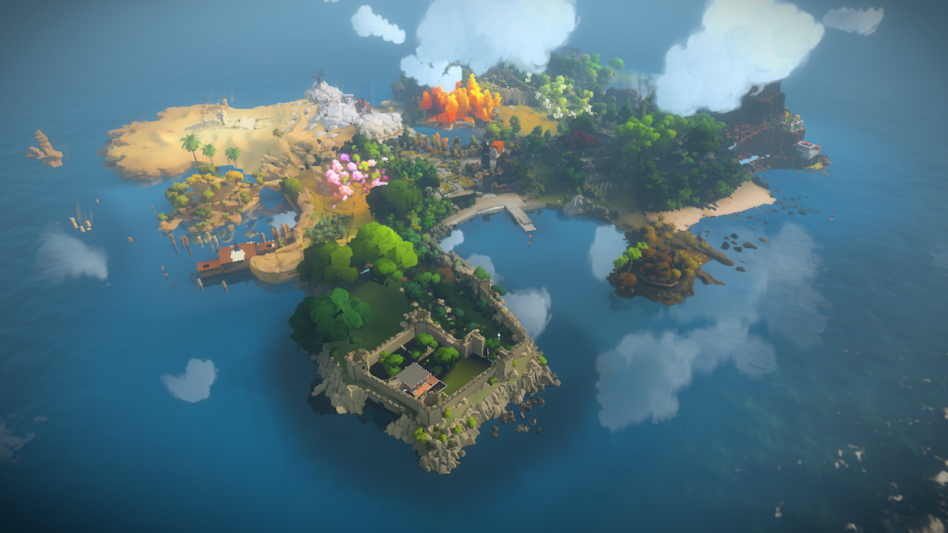
games are interesting here, for example The Witness:

- color-coding whole specific areas
- various elements exist only in specific areas
- a couple of high landmarks visible from almost every part of the map, which makes it easy to figure out where I am
- bash prompt, miller columns, urls, breadcrumbs are all a way to show "you are here" in fractal structures
-
references:
- ideas of landmarks and subconscious orientation are relevant to memory palace ("method of loci") mnemonic technique
- Fractality of Software Tools
- Places in Software
- Canvas for Thinking
In my experience, fractal nesting as a spatial navigation metaphor (folders) fails because fracticality thwarts orientation. Hard to hold a mental map of more than one level of depth. Works great as a contextual navigation metaphor though (links).
— Gordon Brander - https://twitter.com/gordonbrander/status/1320100221976678400
I still think zooming metaphors can sometimes thread the needle because they don’t hide away zoom levels, so you can maintain orientation through overview effect.
— Gordon Brander - https://twitter.com/gordonbrander/status/1320101531341836288
Spatial orientation and mental mappability are fuzzy subconscious sort of processes, but taking The Image of the City as a starting point, I would look to create affordances like paths, edges, districts, nodes, landmarks... especially landmarks
— Gordon Brander - https://twitter.com/gordonbrander/status/1320385864153755648
"Workspace themes" have been a helpful attention hack for working on multiple directories/repos at once.
— Lenny Bogdonoff - https://twitter.com/rememberlenny/status/1322639843890024448/photo/1
- fractal tools seem to give more freedom, but at a cost - how to Orient Myself in these possibly infinite structures (also mentioned in Places in Software)